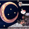
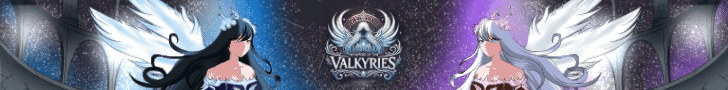
Mystery Posted January 22, 2012 Posted January 22, 2012 (edited) Hi guys!Im pretty still.. Under 'development' when it comes to making images.. etc.. basically Photoshop Lol. Anyways, I've created just some images; some with multiple versions of the same image.Basically, what do you think of them?Before you reply, make sure to use common knowledge if you're gonna criticize.. Don't just reply with, "Nah I don't like it" without giving a reason why you don't.Thanks.---------------------------------------------------------------------------------------------------------------------------------------------------------Archieve Version 1: Version 2: Version 3: Archieve Storyline: Features: Just GHMemorial Features Banners:Random Loading Screens: (Pretty big) These are since last year I had them. Titles (2012): Edited March 11, 2013 by Mysterious Quote
Arcenciel Posted January 22, 2012 Posted January 22, 2012 Last three looks good. Few suggestions though... On the last wiki header/banner, I think that rice/slime looking monster thing shouldn't cover the o. Your combination of mysterious and wiki is interesting and definitely something I haven't seen much before however I don't think it works. All the titles looks nice however, it seems too busy for me with all those monsters around the letters. Maybe decrease the number of monsters by a notch? Quote
Dolphin86 Posted January 22, 2012 Posted January 22, 2012 i think it need some more fresh color to make it more eye catchy...? and more cute monster Quote
Mystery Posted January 22, 2012 Author Posted January 22, 2012 Last three looks good. Few suggestions though... On the last wiki header/banner, I think that rice/slime looking monster thing shouldn't cover the o. Your combination of mysterious and wiki is interesting and definitely something I haven't seen much before however I don't think it works. All the titles looks nice however, it seems too busy for me with all those monsters around the letters. Maybe decrease the number of monsters by a notch? The Rice Cake mob? Well, you don't think it works because the way the i slants for the word 'Wiki'? Or would you rather prefer having the i facing straight going along with MysteriousRO? Yeah, I'd figure the amount of mobs made it look 'cluttered' ;P i think it need some more fresh color to make it more eye catchy...? and more cute monster Making it more eye catching by adding bright colours? Well, gotta watch out for the way the word's colour would collide with mobs used + background on where the image is placed. What are your 'cute monsters'? Quote
Dolphin86 Posted January 23, 2012 Posted January 23, 2012 my cute mob would be poring / poporing / munak / bogun and more.. but these are my fav mobs Quote
Wolfeh Posted January 24, 2012 Posted January 24, 2012 I agree, that the mobs make it look cluttered. I like the idea though, of replacing certain letters with mobs, but it looks like you placed the mob over the original text, it might look better if you remove that particular letter, replace it with some spaces, and then place the mob there. Then, since some mobs aren't as large as the letter (like RO), you could try making them larger. Free-transform is one way (select the layer, select "Rectangular Marque Tool", right click and click "Free Transform", then drag the lower left or right corner while pressing the shift key, so the portions are constrained and it doesn't look stretched), and the other way would be opening the mob and resizing it by itself, then copying and pasting onto your original work. I would suggest going with a theme, you have cute monsters mixed with monsters that have no cute to them, so it kind of throws it off, so either go with the cute or go with the more serious ones (since the server name is Mysterious RO, serious may compliment it more if you choose ones that are mysterious or enchanting). The two red monsters (I've seen them, but don't know their names yet) don't seem to fit at all, because of their color and theme. I think those would fit more with an ocean/beach themed server. I agree with the wiki intersecting with the title, it just doesn't look right. I again like the idea, but I'm not sure as to how to make it work. You could try changing the font and font color, but if that doesn't work then hmm... Well I understand the style, you're trying to combine two subjects. Maybe try combining something related to the wiki software you're using (media wiki?), into the title, like what is seen here, instead of the text. I also like the Mysterious RO text, but the Storyline, Wiki, and Features text look too simple/typical, so they don't have that interesting/wow effect. I like Version 3 the most out of everything, because the stroke and drop shadow make it pop more. 1 Quote
Arcenciel Posted January 25, 2012 Posted January 25, 2012 I agree, that the mobs make it look cluttered. I like the idea though, of replacing certain letters with mobs, but it looks like you placed the mob over the original text, it might look better if you remove that particular letter, replace it with some spaces, and then place the mob there. Then, since some mobs aren't as large as the letter (like RO), you could try making them larger. Free-transform is one way (select the layer, select "Rectangular Marque Tool", right click and click "Free Transform", then drag the lower left or right corner while pressing the shift key, so the portions are constrained and it doesn't look stretched), and the other way would be opening the mob and resizing it by itself, then copying and pasting onto your original work. I would suggest going with a theme, you have cute monsters mixed with monsters that have no cute to them, so it kind of throws it off, so either go with the cute or go with the more serious ones (since the server name is Mysterious RO, serious may compliment it more if you choose ones that are mysterious or enchanting). The two red monsters (I've seen them, but don't know their names yet) don't seem to fit at all, because of their color and theme. I think those would fit more with an ocean/beach themed server. I agree with the wiki intersecting with the title, it just doesn't look right. I again like the idea, but I'm not sure as to how to make it work. You could try changing the font and font color, but if that doesn't work then hmm... Well I understand the style, you're trying to combine two subjects. Maybe try combining something related to the wiki software you're using (media wiki?), into the title, like what is seen here, instead of the text. I also like the Mysterious RO text, but the Storyline, Wiki, and Features text look too simple/typical, so they don't have that interesting/wow effect. I like Version 3 the most out of everything, because the stroke and drop shadow make it pop more. You've put into words things I couldn't describe to him. Nice interpretive skills. 1 Quote
Lightning Posted January 25, 2012 Posted January 25, 2012 the "wiki" text on the first 3 banners looks like its more of a background image rather than a title..maybe you could liven up the colors? gj tho Quote
Mystery Posted January 29, 2012 Author Posted January 29, 2012 Wow, indeed Wolfeh, thanks ! Photoshop is meh to me, I don't really focus much on photoshop, basically just enough to get my by for what I really need done. the "wiki" text on the first 3 banners looks like its more of a background image rather than a title..maybe you could liven up the colors? gj tho Is it cause of the way it's slanted and not really mixed in with MysteriousRO? Quote
MaterialBlade Posted January 29, 2012 Posted January 29, 2012 We meet again comic sans... Imo never use comic sans for anything. It is an awful font. Quote
Mystery Posted March 16, 2012 Author Posted March 16, 2012 (edited) *Update: This is just a draft of the banner: Comments? o_O I know professional staff isn't aligned properly.. =/. Couldn't seem to fit it in <.> Edited March 16, 2012 by Mysterious Quote
Mystery Posted June 29, 2012 Author Posted June 29, 2012 Updated first post! Note: I like my third GH image because it was my first time actually knowing how to make an image with rounded corners LOL. D: Also, there aren't a lot of funky, funish styles at dafont.com Quote
Sharpienero Posted June 29, 2012 Posted June 29, 2012 This one is the best. It's cute, and the colours are very eye appealing. Images like these are good! The other wiki ones are far too cluttered, and they make me eyes and brain say "wtf" when I look at them. Quote
Mystery Posted June 29, 2012 Author Posted June 29, 2012 This one is the best. It's cute, and the colours are very eye appealing. Images like these are good! The other wiki ones are far too cluttered, and they make me eyes and brain say "wtf" when I look at them. Thanks. I wanted to sorta combine the colours from teh Smokie ;p Quote
Mystery Posted June 30, 2012 Author Posted June 30, 2012 what font you use sir? i like it..XD One is Berlin and another is a custom font. Quote
Mystery Posted July 2, 2012 Author Posted July 2, 2012 Thanks guys! I'm practicing a lot lately. I don't wanna be a "Professional" designer or anything.. I just wanna do the basics and I think I'm already getting there xD Quote
Sharpienero Posted July 3, 2012 Posted July 3, 2012 Thanks guys! I'm practicing a lot lately. I don't wanna be a "Professional" designer or anything.. I just wanna do the basics and I think I'm already getting there xD If you need any tips send me a message. Quote
Mystery Posted August 16, 2012 Author Posted August 16, 2012 Added Banners D: Banners: The second banner is just a random name =/ I'll be creating different ones later tomorrow. Preferably, bigger size. Quote
Mystery Posted August 23, 2012 Author Posted August 23, 2012 Added couple new images: Comments welcomed ! Quote
Mystery Posted March 11, 2013 Author Posted March 11, 2013 These are since last year I had them. Titles (2012): Quote

Recommended Posts
Join the conversation
You can post now and register later. If you have an account, sign in now to post with your account.