Arcenciel Posted December 12, 2011 Posted December 12, 2011 Here's an old web design that I made for what is supposed to be a personal site. Sadly, it never got coded since I lack the skills to do the slicing and coding of it. I posted it in eA a long time ago but barely got any comments so I thought I'd post it again. 1 Quote
Mercurial Posted December 12, 2011 Posted December 12, 2011 (edited) 1/10 dunno just to dead on the eyes Edited December 12, 2011 by Mercurial Quote
Chemical Crush Posted December 12, 2011 Posted December 12, 2011 If you look at Markyeel's other 'rates' on peoples topics you'll see that they give low rates and no explinations, no point in asking them why cause they most likely won't tell you. Now, I have to agree its a little bland. But, at least it's clean and the colors all match, I've seen far worse. Since it's a personal site, I assume not an RO one, I couldn't tell you much to do with it because I have no idea what you are aiming for. 1 Quote
Diconfrost VaNz Posted December 12, 2011 Posted December 12, 2011 nice color combination 8/10 1 Quote
Arcenciel Posted December 12, 2011 Author Posted December 12, 2011 If you look at Markyeel's other 'rates' on peoples topics you'll see that they give low rates and no explinations, no point in asking them why cause they most likely won't tell you. Now, I have to agree its a little bland. But, at least it's clean and the colors all match, I've seen far worse. Since it's a personal site, I assume not an RO one, I couldn't tell you much to do with it because I have no idea what you are aiming for. Yeah, I did that and you're most likely right bout him It is a personal site. I was aiming for a minimalistic blog-like design, good combination of different shades of blue, and different depths through the layering of the colors. I'm pretty much done with the design. I'm content with it, just wanted feedback. So thanks! nice color combination 8/10 Thanks! Quote
Chemical Crush Posted December 12, 2011 Posted December 12, 2011 For a blog type design I think this looks perfectly fine. You don't want it over crowded but not too plain, so imo you did great. Quote
Mirage Posted January 5, 2012 Posted January 5, 2012 I wanna do a blog site, but I dunno what to blog about haha. 8/10 I love it. Its very peaceful Quote
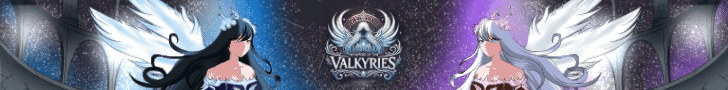
manabeast Posted January 5, 2012 Posted January 5, 2012 feel leg of anime texture hmm.... there is human there but so lonely = =" if add a half anime streetz background for the human in header? about colour blue was really nice but blue kinda suit frozen / freeze thing =), if using frozen mountain/freeze ice something maybe match. rate: 5/10 Quote
Yuki Posted January 6, 2012 Posted January 6, 2012 It is a very nice, simple design. The colour theme works out very well. I do have to say that it is lacking in some pictures/words. Maybe it would look more complete if you added a blog or something else to give a better overall view of the website. There seems to be a big space between the logo and the middle blue box (Will something go there? The title of the blog post?). It just looks really empty in the middle, so perhaps you may want to show how the words/blog posts would look =D. The character design looks like it's been stretched out (horizontally by a bit). The fonts used are very soothing and fit the sky/cloud theme well. Good job with this design overall! Quote
Arcenciel Posted January 6, 2012 Author Posted January 6, 2012 It is a very nice, simple design. The colour theme works out very well. I do have to say that it is lacking in some pictures/words. Maybe it would look more complete if you added a blog or something else to give a better overall view of the website. There seems to be a big space between the logo and the middle blue box (Will something go there? The title of the blog post?). It just looks really empty in the middle, so perhaps you may want to show how the words/blog posts would look =D. The character design looks like it's been stretched out (horizontally by a bit). The fonts used are very soothing and fit the sky/cloud theme well. Good job with this design overall! Thanks! Well the overall style was intended to be a blog. And yeah there is a huge space between the logo and the first entry. The first entry box does indeed need to be moved higher. The middle part of it or that empty space is supposedly just a repetition of the content box. I didn't want to make it look crowded since it's just a sample. I may have improperly scaled the image in Photoshop. I don't clearly remember since I created this such a long time ago. =P Quote


Recommended Posts
Join the conversation
You can post now and register later. If you have an account, sign in now to post with your account.