Mystery Posted August 8, 2013 Posted August 8, 2013 (edited) Hey guys~ I decided to practice my skills a little bit when it comes to designing... so I thought I should try creating a very simple Website design... and well, I think I have . What do you guys think of it? Please note that this is just a PSD and it is not coded =3 PS: It seems I spelt "created" wrong in the copyright section... *facepalm* xD Rate and comment :3! Note: I'm planning to update this thread as I progress through. Edited August 8, 2013 by Mysterious 1 Quote
mrlongshen Posted August 8, 2013 Posted August 8, 2013 nice mysterious.. 9/10. dont you want make the navigation menu on the center not the left side ? Quote
Mystery Posted August 8, 2013 Author Posted August 8, 2013 Looks clean 9/10 <3 Thanks a lot <3 nice mysterious.. 9/10. dont you want make the navigation menu on the center not the left side ? I made the navigation menu on the left just because it's "Simple" as stated in the title . Other designs I'll have the navigation menu centered or kept on the left etc. Just really depends what I'm going for Quote
Jasc Posted August 8, 2013 Posted August 8, 2013 6/10 Love the header, great title, good space and usage of woe, online status, registration box/account, great background and color. Middle of the page, welcoming, banners are good, standard layout. Navigation menu looks plain, nothing special, could use actual buttons to make it look more exquisite, like more work was put into it. Useful links and rankings seem out of place, could use some re-organization. Quote
Chemical Crush Posted August 9, 2013 Posted August 9, 2013 Thing I dislike most is the actual 'Starlite RO' font. Idk, I don't like that it looks bubbled and the font is just..boring. Ive no idea how to explain that. Other than that its pretty simple. 7/10 Quote
Mystery Posted August 9, 2013 Author Posted August 9, 2013 6/10 Love the header, great title, good space and usage of woe, online status, registration box/account, great background and color. Middle of the page, welcoming, banners are good, standard layout. Navigation menu looks plain, nothing special, could use actual buttons to make it look more exquisite, like more work was put into it. Useful links and rankings seem out of place, could use some re-organization. Thank you very much. I know about the images for the navigation but I didn't want the sidebar crowded a bit with monster images etc. Thats why with my next design I made the lovely navigation the same as every other design... in the middle. Lawl xD Thing I dislike most is the actual 'Starlite RO' font. Idk, I don't like that it looks bubbled and the font is just..boring. Ive no idea how to explain that. Other than that its pretty simple. 7/10 Heh, if you know a lot of better "popping" fonts, gimme plox <3 1 Quote
Chemical Crush Posted August 9, 2013 Posted August 9, 2013 dafont.com I get all my fonts there! Quote
Mystery Posted August 11, 2013 Author Posted August 11, 2013 Yeah I use that site too, but I don't know any really fancy fonts yet Quote
Chemical Crush Posted August 11, 2013 Posted August 11, 2013 (edited) Just look around on there. It really depends on what kind you're looking for. There is one that has stars in it, I think its called Moon Star or something like that, take some time to look at some of the fonts, it really makes or breaks some things when web design or even loading screens are concerned. There are some nice Calligraphy fonts. http://www.dafont.com/theme.php?cat=601 Edited August 11, 2013 by Chemical Crush Quote
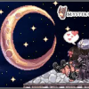
Mystery Posted August 12, 2013 Author Posted August 12, 2013 Here's another design: New~ SakuraRO (If you don't like pink, oh well xD) I know the characters are a bit odd, but I'll fix em later. Quote
mrlongshen Posted August 12, 2013 Posted August 12, 2013 Here's another design: New~ SakuraRO (If you don't like pink, oh well xD) I know the characters are a bit odd, but I'll fix em later. yahhh. mysterious is girlish. hehehe.. 9.5/10 for girl. hehehe is this flux sir ? Quote
Mystery Posted August 12, 2013 Author Posted August 12, 2013 yahhh. mysterious is girlish. hehehe.. 9.5/10 for girl. hehehe is this flux sir ? Well, anyone who likes pink haha Yeah, it's flux based. Here's a different view: Quote
mrlongshen Posted August 12, 2013 Posted August 12, 2013 yahhh. mysterious is girlish. hehehe.. 9.5/10 for girl. hehehe is this flux sir ? Well, anyone who likes pink haha Yeah, it's flux based. Here's a different view: nah. the bg is much better. 9.7/10. make the default theme for hercules Quote
Chemical Crush Posted August 12, 2013 Posted August 12, 2013 I actually like the pink. And I like this layout more than the first one. =] 8/10. I really think its cause, although you used the same font, your layout looks a little more organized? Idk, on the first website your column on the left hand side looks..odd? Like I said, im not sure, but I do like this second one. Good job! Quote
Mystery Posted August 12, 2013 Author Posted August 12, 2013 nah. the bg is much better. 9.7/10. Heh, thanks I actually like the pink. And I like this layout more than the first one. =] 8/10. I really think its cause, although you used the same font, your layout looks a little more organized? Idk, on the first website your column on the left hand side looks..odd? Like I said, im not sure, but I do like this second one. Good job! The font is actually a bit different than the first one haha. I hope you dont just like this one just because it's pink heh xD Thanks! 1 Quote
Chemical Crush Posted August 12, 2013 Posted August 12, 2013 Haha no, I dont really like pink a WHOLE lot. Purple is actually my favorite color! I just really like this layout. You also used very good colors in combination with the pink. =] Quote
Mystery Posted August 12, 2013 Author Posted August 12, 2013 Haha no, I dont really like pink a WHOLE lot. Purple is actually my favorite color! I just really like this layout. You also used very good colors in combination with the pink. =] I'll keep that in mind then Thanks. I tried to make good use of the background to sorta have everything "Blend" in. Quote
Mystery Posted August 14, 2013 Author Posted August 14, 2013 I'll be releasing my first design for free... just keep in mind that it's a PSD Quote

Recommended Posts
Join the conversation
You can post now and register later. If you have an account, sign in now to post with your account.