Andre Posted January 5, 2012 Posted January 5, 2012 (edited) Hey, please rate 1 to 10 Loading Screens comming soon Achievement Pictures v1 v2 Website v1 v2 Edited January 7, 2012 by Andre 1 Quote
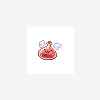
KeiKun Posted January 5, 2012 Posted January 5, 2012 not bad i love the Login Button since its blue poring looks cute xD font looks crappy on my eyes ~__~ Quote
Andre Posted January 5, 2012 Author Posted January 5, 2012 not bad i love the Login Button since its blue poring looks cute xD font looks crappy on my eyes ~__~ The Poring is from Poring Card haha xD Font from the Achievement or the Website? Quote
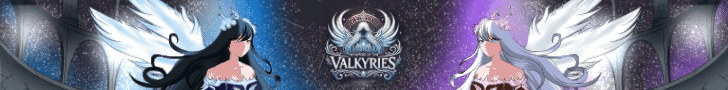
Yuki Posted January 6, 2012 Posted January 6, 2012 Website: It's a good, simple design, though it feels somewhat bland. Maybe add a button or two with more RO-related images to the left side below your navigation box XD. I like the mouseover effect you have for your top navigation bar. As for the silver bar at the top where it indicates "Player Online" (maybe add an "s" to "Player") and "Status", it looks quite empty in the middle. Maybe add a Server Time indicator closer to the "Status" side. Furthermore, maybe add a button or an image slider in between the login box and the navigation box on the left side to fill in that empty region as well. I sort of like the fonts that you used for the website =D (even if it's commonly used, it seems to match the website somewhat well). Good try overall! Card: I agree, the images you used are cute and nicely put. The fonts are alright. Quote
Mirage Posted January 8, 2012 Posted January 8, 2012 I love the v2 picture. Where do you get it from? Just random searching or custom made? Quote
Andre Posted January 8, 2012 Author Posted January 8, 2012 I love the v2 picture. Where do you get it from? Just random searching or custom made? v2 of achievements? achievement pictures are selfmade. only the illustration is from the ragnarok client^^ Quote
Dolphin86 Posted January 8, 2012 Posted January 8, 2012 like the website color, but the achievement need some more tweaking... dont ask me it kinda messy? Quote
Yuki Posted January 11, 2012 Posted January 11, 2012 v2 for both definitely look better <3. I love the background image for the website! Maybe you can add a small footer banner/image so that it doesn't look too empty near the bottom as well (instead of just completely blue). Good job with the improvements! Quote

Recommended Posts
Join the conversation
You can post now and register later. If you have an account, sign in now to post with your account.