

Leaderboard

Popular Content
Showing content with the highest reputation on 02/17/24 in all areas
-
@Westin More respect for Tokei, one of the greats, you always have the option of using another program if you did not like this one, but it is not appropriate to demand something from someone knowing that you did not contribute anything to that project.1 point
-
Version 1.0
3758 downloads
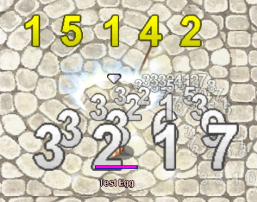
Hi all, This is a basic damage font alternative which can be used to bring a little more high definition resolution to Ragnarok! I made this purely because I was tired of staring at the hideously stretched and over-pixelated damage numbers while I was doing some testing. Feel free to give it a try! There is a slightly wider spacing between digits that I wasn't able to close off because the client must determine spacing/positionings between, but if you want to reduce some of the spacing I have provided another .act file suffixed "_larger" which reduces the spacing but makes the damage text a bit larger. ThanksFree1 point