


ParIsMakulit
-
Posts
117 -
Joined
-
Last visited
-
Days Won
1
Content Type
Profiles
Forums
Downloads
Jobs Available
Server Database
Third-Party Services
Top Guides
Store
Posts posted by ParIsMakulit
-
-
10/10
No coding?I'm sucks with coding

haha
How to coding?what software you use to coding?


I think Dreamweaver
-
10/10
No coding?I'm sucks with coding
haha
-
I'm looking for a affordable RO Website maker..
Kindly contact me here: 09465885720 and will talk about it..
Ask We Prioritize
-
-
nakakabadtrip na tong Nova napakayabang kala mo magaling
-
Is this for flux cp?
Yup
-
badasss!
 ) Can you share it? Hehe.
I Dont know bro if i will share it
9.5/10.Good job

Thanks Gm Helena
10/10 po sir
 -Louie Saguinsin
Thank you dude
-
Many Comment
-
-
My New Design Website
Enjoy
Hope you like it
then
Comment
0 - Bad
10 - Good Job
-
 1
1
-
-
common as in i see the same thing being done in almost all flux design the way content is being displayed.
ha ok sir
-
the text could use a little more work also im not feeling the allout green design at all or the big green navigation either the background would look awsome if it were somewhat more cartonish or drawn. overall rating i would say 6/10 until u fix the minor problems and because ive seen this kind of design is too common.
What is the common sir
I will change the background sir
and i will change the font
-
omg. Why is my name in your site PapaZola?

I dont have anything to do with the website.
Haha
-
Hey Guys!
This is my New Flux Website
Nature Ragnarok Online
Hope you like it
Please Comment and Rate my work
And Comment what i need to change
Rate
0 - 10
0 - Very Super Duper Bad
10 - Good Job and Improve More
Not Coded yet

-
Are you going to make it a free release
Nope
I Delete the PSD of that
I DOnt like it
-
Pilopil i need only the image that using spray can you send it
-
Pilopil can i have the image
Number 2
The Image that is using spray
-
Hi guys this is my new design
hope you like it enjoy
rate 1 - 10
I'm not professional designer

-
9/10

GM Helena Thanks
9/10 simple but good!
Thanks Seizure
-
Dude Your work is Messy
-
awesome
9/10
i like ur design
Thanks Bro
-
9/10
simple and looking good
Thanks
9/10 I dont know, its looks great but at the same moment mainstream.. Its missing something.
Thanks
I like it.. however I think things should be changed to make it more RO'ish. Currently, your design looks all futuristic and not really.. RO'ish so to speak.
Thanks
9/10
the minus points because of the background xD, i always encounter that background almost everywhere xD
Thanks
-
Than
cool. 8/10.
keep up a good work
Thank you GM Helena
cool
Thanks
-
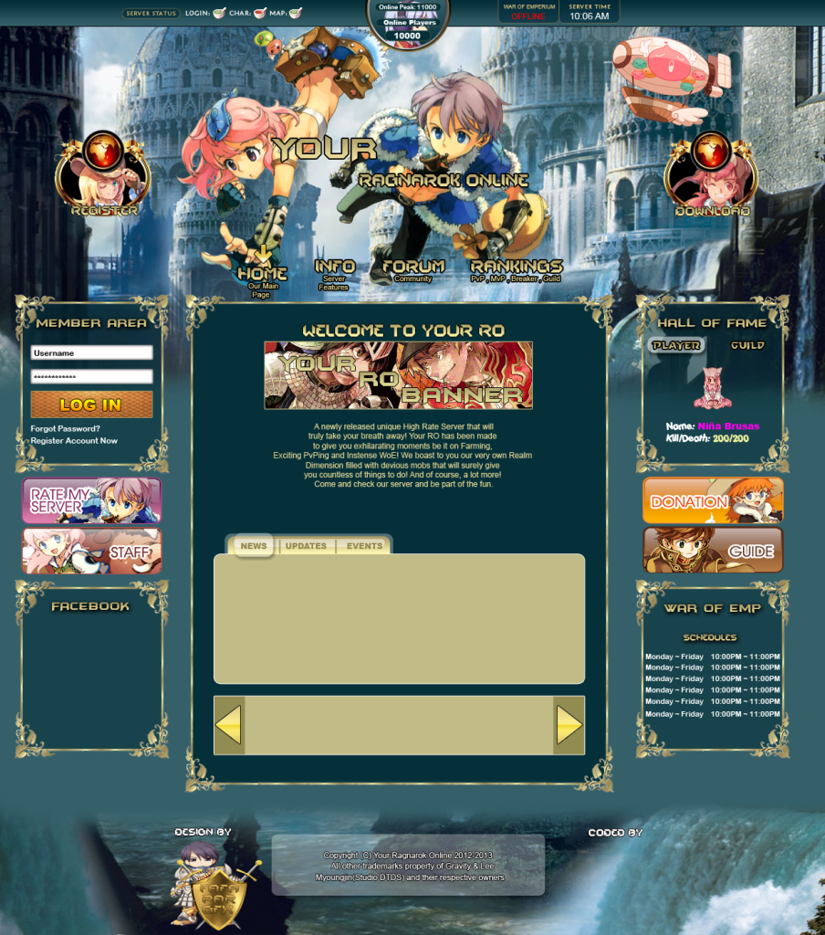
Sorry I'm Lag in rathena
Rathena is too lag now
ah. i can see the image. err
i think you must align the account panel on server status
8/10
Bro I Align the Server Status at the Body Content
^ Lol XDDD to Xtremist's comment.
I see it now haha xD, guess he forgot to add the image and spoiler. He added them in an hour and a half.
The design itself has a neat layout to it! The top background image is kind of creepy, might be alright for others, but personally it's not my taste. The footer image is nice though =D. The top character by the account panel box looks compressed (same with the RO character below, but not as much as the first one). The WoE castle image looks cool, but it somehow feels very different graphically apart from the other images of the design. Don't know if you want it to be uniform or not. The navigation bar at the top should have the same style as the designs below (like the metal-like rods below can be added to it, etc).
Overall, it looks like a good design! Keep it up <3!
Thank You
I will do my best
ah. i can see the image. err
i think you must align the account panel on server status
8/10
I Align the Server Status at Body Content that's why like

New Website Template by Fafa Par GFX
in Arts & Writings
Posted · Edited by Parparazzi
Oh my God we are the same
Loouuiiss
I Will try to change it