


xMiland
-
Posts
95 -
Joined
-
Last visited
Content Type
Profiles
Forums
Downloads
Jobs Available
Server Database
Third-Party Services
Top Guides
Store
Crowdfunding
Posts posted by xMiland
-
-
Oh is that you? I watched all your videos when I was trying to learn Brow Edit.
Man without your videos, I will really have a hard time learning it.
Thanks for your videos, it helped a lot.

-
I'll give it 7/10 its really nice and peaceful

I'll give it 7/10 its really nice and peaceful
+1
i like the theme of the whole city.
Thank you.

-
^ LOL you two. D: Not fair, us wants to play too.
I'm impressed. Nice work, I'll expect more updates can't wait for it's public beta. .
-
 1
1
-
-
Okay thanks. I guess I'll just put the following lines to be sure.
-
Hello, question.
ro_world.gndro_world.gat
ro_world.rsw
À¯ÀúÀÎÅÍÆäÀ̽ºmapro_world.bmp#À¯ÀúÀÎÅÍÆäÀ̽ºmapro_world.bmp#
What does the
ro_world.gndro_world.gat
ro_world.rsw
clearly do?
I only add this line
À¯ÀúÀÎÅÍÆäÀ̽ºmapro_world.bmp#À¯ÀúÀÎÅÍÆäÀ̽ºmapro_world.bmp#on my resnametable for the minimap. Will there be any disfunctionalities on my map if I don't add the other lines above?
-
Hello guys !
I made this map long time ago and didn't used it. I was bored so I finished it and thought to release it here in eA.
Rate it guys .
 Feel free to use it for your server.
This file includes:
~ .rsw file
~ .gnd file
~ .gat file
~ .extra file
~ .bmp file (minimap)
Screenshots:
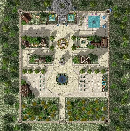
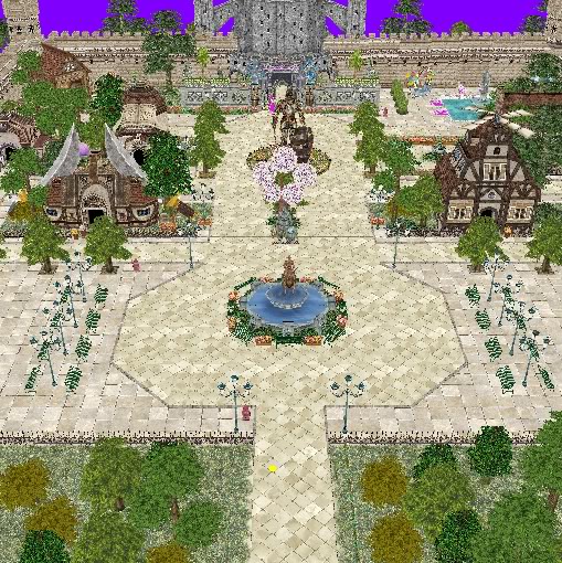
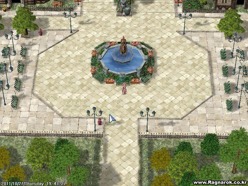
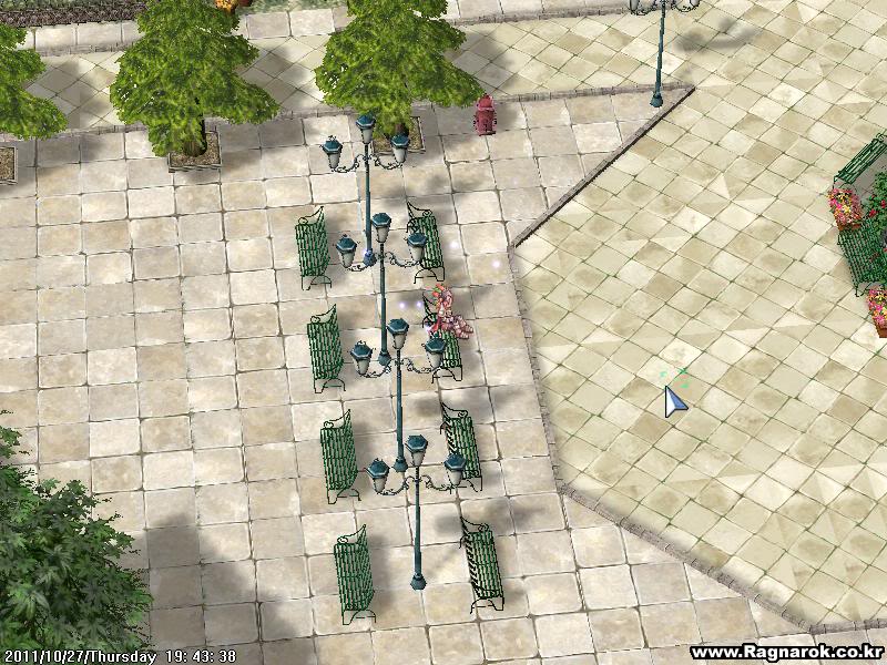
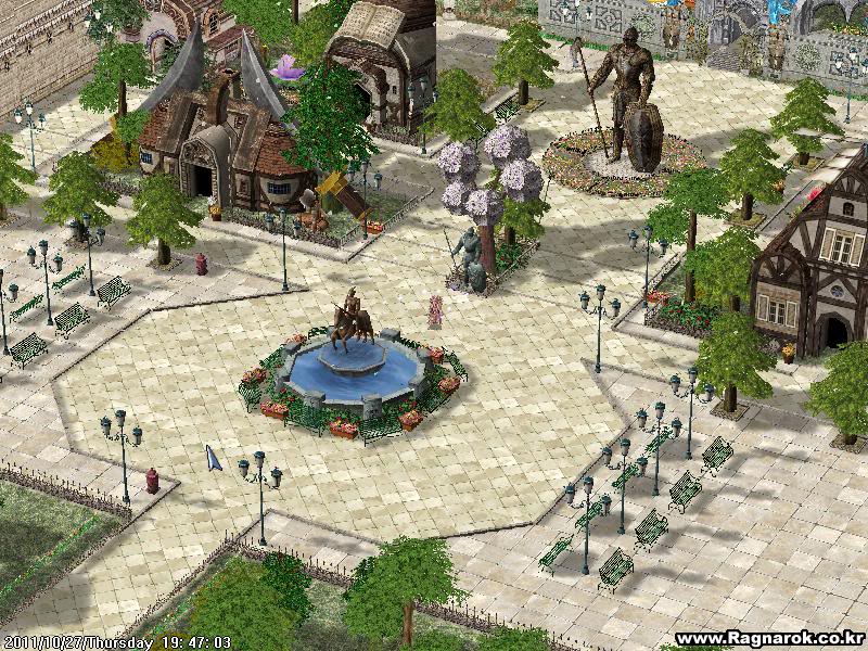
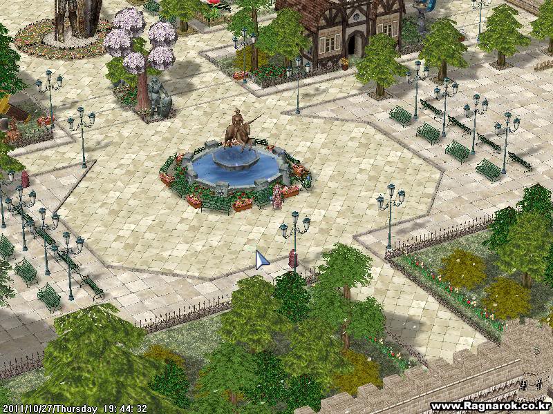
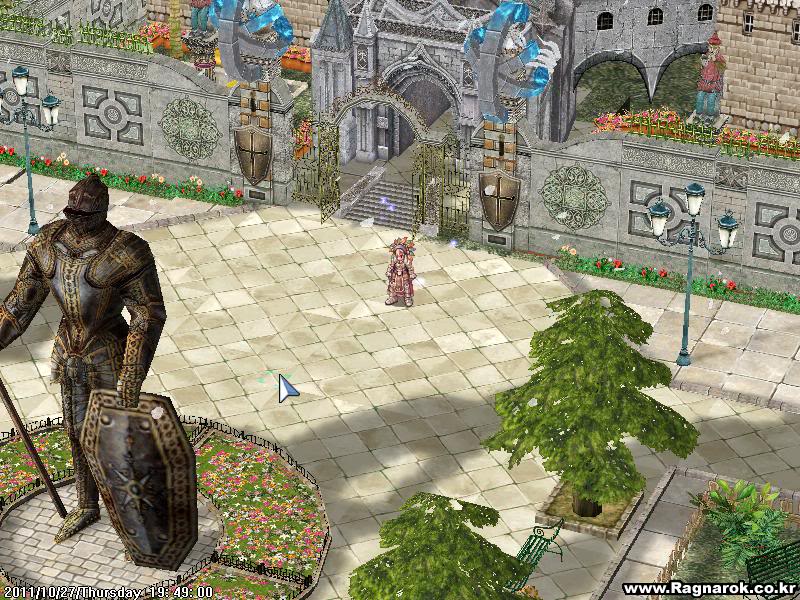
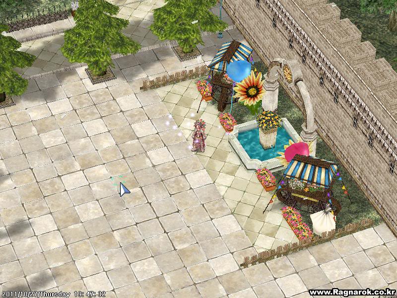
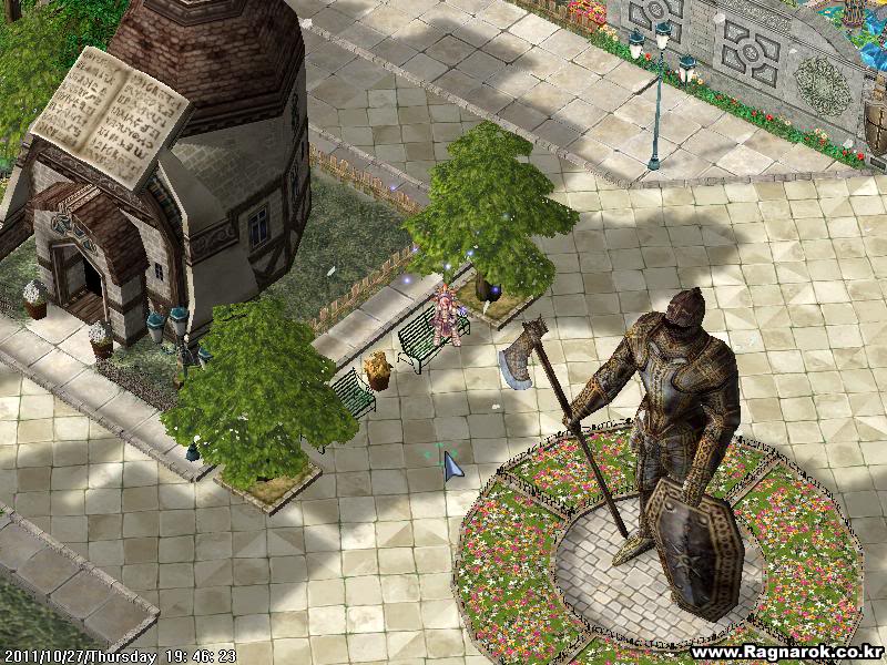
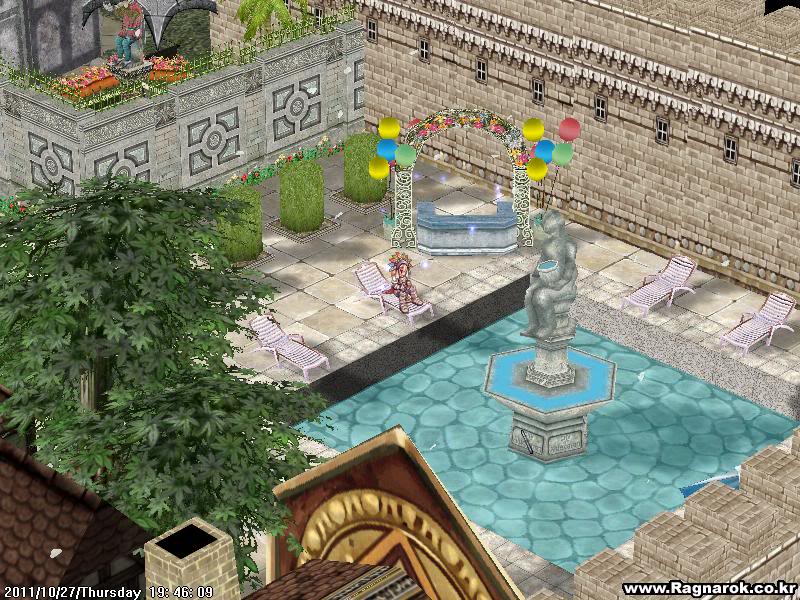
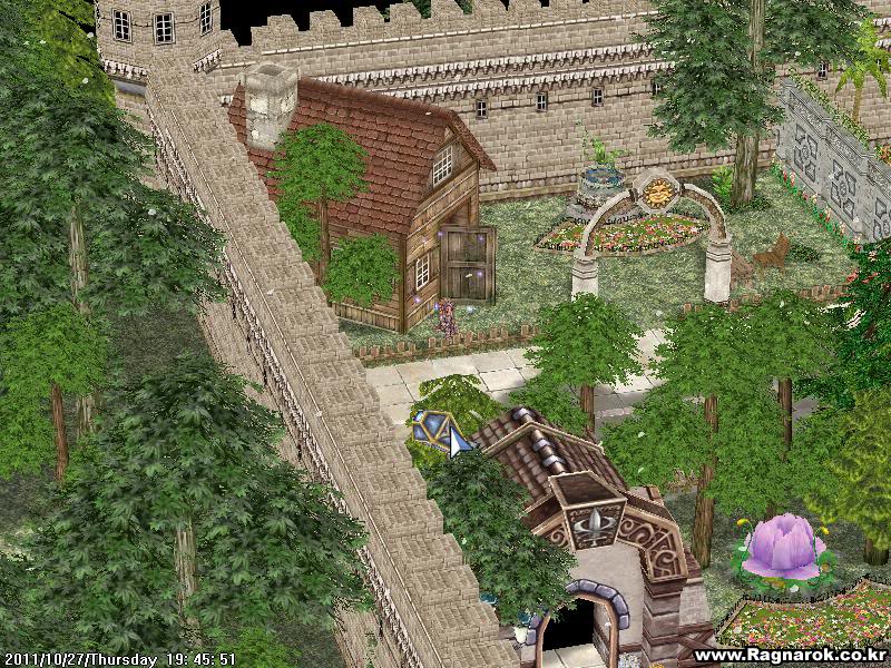
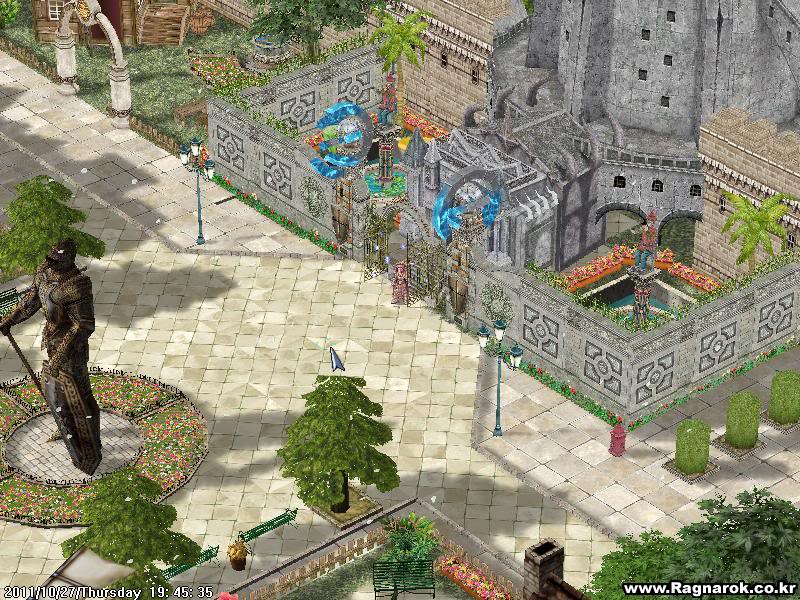
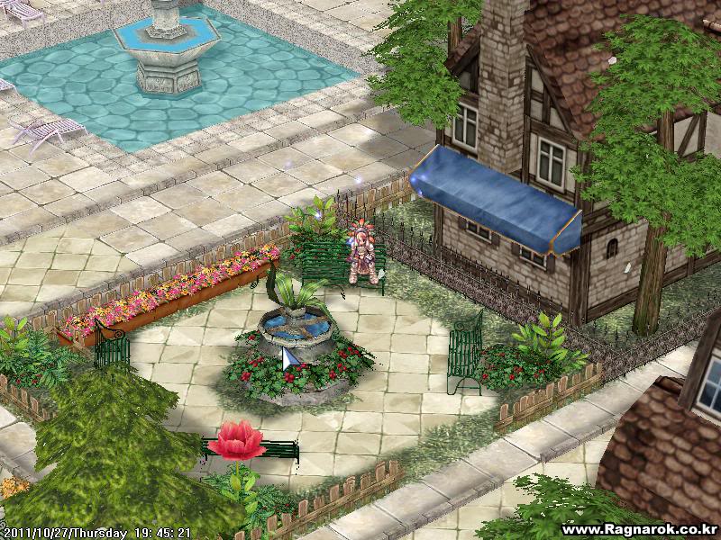
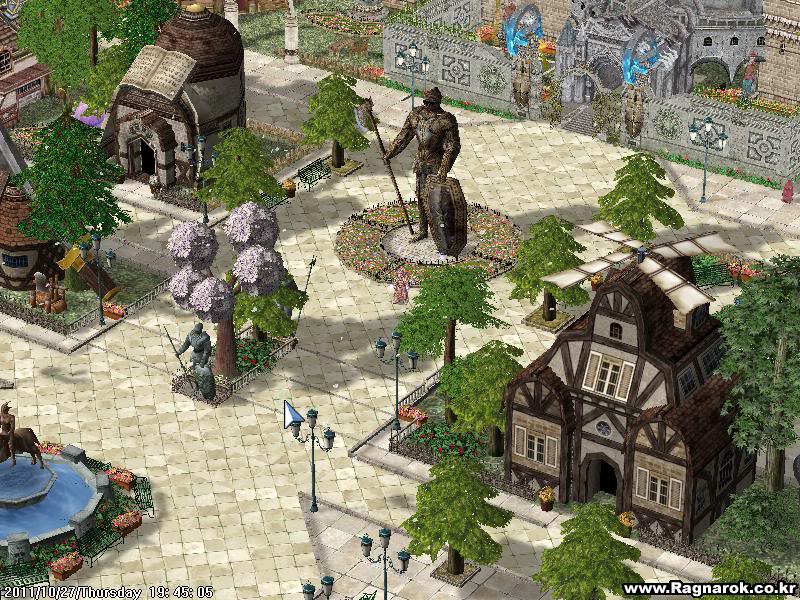
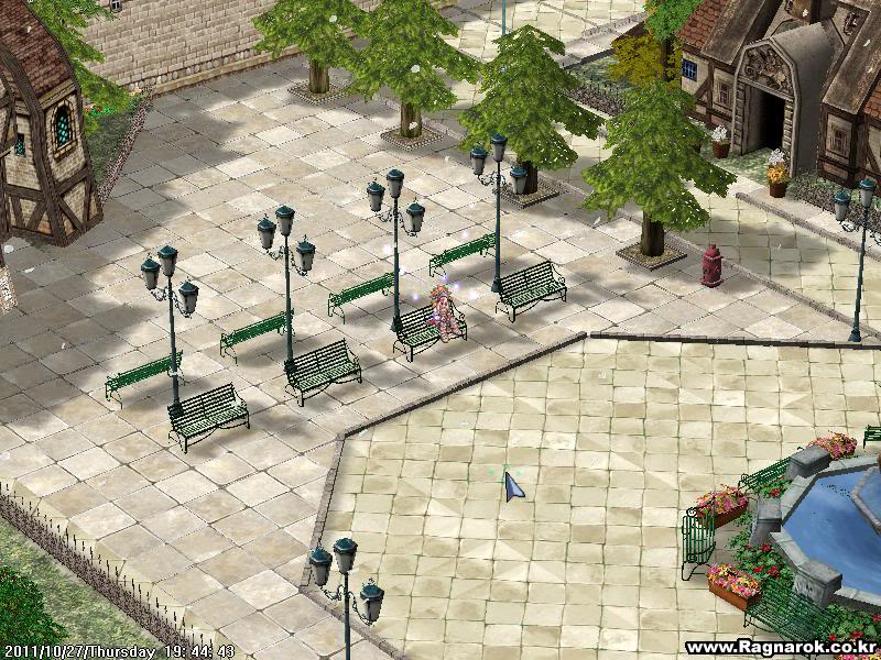
Enjoy and don't forget to say thanks.
-
8
-
 1
1
-
-
Love them.
But it would be better if the colors of the ranks would match the current group colors here in eA. Like admin-red,donator-pink and etc.
Very good work.
-
LOL Hi thar.
-
I think those phrases "this is cool", "this is great" are not worthless or irrelevant posts specially when the author of a certain thread wants a feedback from his/her work.
In my opinion, those word sometime is kinda useless as it doesnt help much except in praising how great / nice is the author work...
if i was the author , i would prefer something like "Suggestion Feedback" and NOT just "this is cool" , "this is great" , "love it" , "thank you" and blablabla....
But it also helps audiences whether the product is interesting or not from this feedbacks.
So you'll be happy in your thread that contains a lot of suggestions not containing those phrases mentioned above even one?
the reason they want feedback , most of the time are refer to suggestion which could help the aurthor to improve his works...But still those phrases above are feedbacks, unless you want suggestions only.
But hey we can't stop people posting this things because sometimes that's how they appreciate someone's work.
-
I think those phrases "this is cool", "this is great" are not worthless or irrelevant posts specially when the author of a certain thread wants a feedback from his/her work.
But seeing it in almost all the thread is ok too?
It's not okay if you're really a criticizer. but If I'm a thread starter and people post stuffs like this, i'll be enlightened of course.
And if I'm an audience also, this kind of posts will help the audience convince or will have interest of a certain thread.
-
New Logo? Okay. But please, don't use one like this. This is a developer community (isn't it?) and no fantasy board.
In my opinion the new logo should look clear and professinal instead of coltish and colorful.
I would have to agree with some of the comments above. Ideally we would want a logo that is more professional looking.
I agree.
The logo seems to be common from game communities.
I'll prefer the old one, but if eA needs a new one, why not?
Cannot outdue Mystogan's sprited logo, but I figured I would throw in some 'professional' looking logos; they were actually very fun to make!
Right-Sided Icons


Left-Sided Icons


Myriad Pro Font & Anti-aliasing removed on sub-wording

Words shortened

Different colour themes


Edit: Please expand to look, seems attachments are smaller =p
- Font could be thinner/more like current IPB font
- Maybe none of the sub-wording at bottom? (An Open-Source Ragnarok Emulator)
- Myriad Pro Font looks better then Harabara
- Space between EA-THENA is the font's fault; I can manually evenly space them out
Omg this are awesome. <3
- Font could be thinner/more like current IPB font
-
I think those phrases "this is cool", "this is great" are not worthless or irrelevant posts specially when the author of a certain thread wants a feedback from his/her work. This phrases mostly means like you appreciate or you find this thing interesting.
But I agree with the "+1" though, there's a button for that now.
-
I think if I managed my own server ill create and use this for new world of ragnarok, ive already testing every town fields and dungeons, for now im looking for some custom monster for new world.
Try using green-peach's trickster mob sprites. They'll fit on some of the maps.
Great work as always Aerie !


Huge Graphic Request! (2 Requests)
in Graphics Requests
Posted
Hello z3ro.
You've helped a lot of scripters (including me) and now it's payback time.
Hope you'll like it.