- Free
- Version 1.0
- 4391 downloads
Hi all,
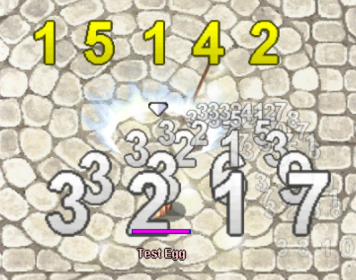
This is a basic damage font alternative which can be used to bring a little more high definition resolution to Ragnarok! I made this purely because I was tired of staring at the hideously stretched and over-pixelated damage numbers while I was doing some testing. Feel free to give it a try! There is a slightly wider spacing between digits that I wasn't able to close off because the client must determine spacing/positionings between, but if you want to reduce some of the spacing I ha